Portfolio Website Design & Development

The Project
Project Duration: 4 weeks
While researching about the UI UX field one of the first things I came to learn was the importance of having a personal website and how it was also considered as an essential part of a job candidate by many recruiters in the field. My aim with creating this website was to showcase sample UI UX projects to the recruiter so they can get an insight on my skills and work process as well as a bit about who I am. Overall the main objective was to create a website worthy of the recruiters time while delivering the content in a simple yet effective way.
The Process

Process flow

Discovery
To kick off the project I drew inspiration from different types of portfolios I came across on the web. Going through them helped me to figure out what I wanted to create and what I should do and what not to do as well.
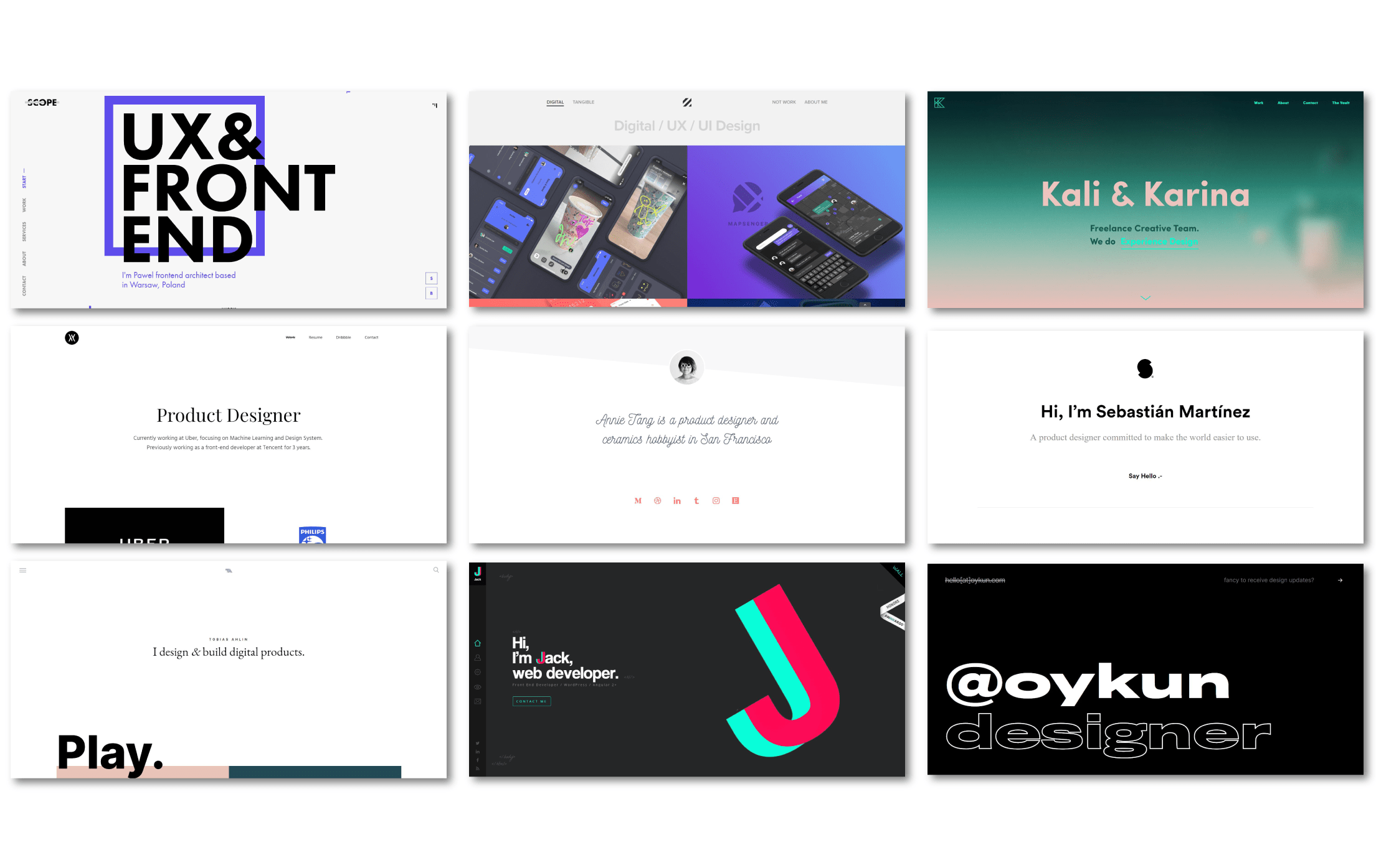
Some web portfolios I drew inspiration from
Going through these I recognized some popular trends that were common among most websites that I decided to include in my own project such as the use of white spaces, big and bold typography and single page designs. I also recognized some designs which were not as user-friendly, for example using too many animations, no hierarchy or flow, lack of context in the information included or too much information.
I also read up on articles by recruiters and industry experts in the UI UX field to gain insight on what they were looking for and expecting from an online portfolio. Some things I picked up that I followed are:
1. not to just include end project results but to show the process gone into getting there
2. keeping in mind the number of projects to include , 2-5 is the sweet spot
3. clearly show what your skills are and focus the content on the job that you want
4. add some personality to the website
5. make content skimmable and easy to digest
and finally and most importantly 6. have a clear structure to the website
To kick off the project I drew inspiration from different types of portfolios I came across on the web. Going through them helped me to figure out what I wanted to create and what I should do and what not to do as well.
Some web portfolios I drew inspiration from
Going through these I recognized some popular trends that were common among most websites that I decided to include in my own project such as the use of white spaces, big and bold typography and single page designs. I also recognized some designs which were not as user-friendly, for example using too many animations, no hierarchy or flow, lack of context in the information included or too much information.
I also read up on articles by recruiters and industry experts in the UI UX field to gain insight on what they were looking for and expecting from an online portfolio. Some of the things I picked up that I followed are:
1. not to just include end project results but to show the process gone into getting there
2. keeping in mind the number of projects to include, 2-5 is the sweet spot
3. clearly show what your skills are and focus the content on the job that you want
4. add some personality to the website
5. make content skimmable and easy to digest
and finally and most importantly 6. have a clear structure to the website
Information Architecture
Ideation
Before moving towards creating the website, I wanted to have a clear understanding of why I wanted this site, which in my case was to show recruiters and hiring managers sample projects to maximize my chances of getting a job. Having that main goal in mind I moved onto conceptualize how the site needed to be structured and what components should go into it.
Information Architecture
Once I had a clear understanding of what I wanted to achieve in the website, the next step was to identify what the content should be. Since web folios also serves some purposes of what a resume does, the basic things to include were a brief section about myself, education, contact information and also most importantly sample projects to showcase work for the visitors to review.
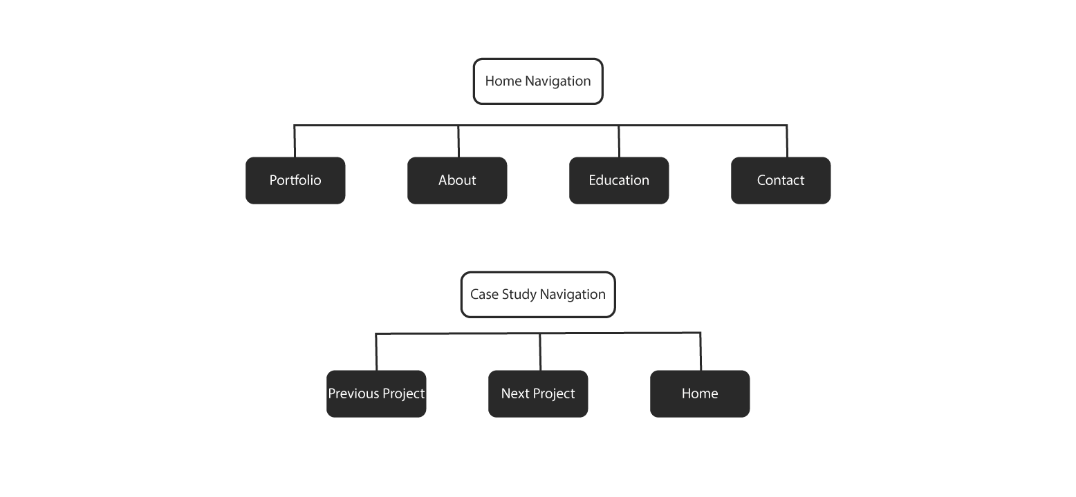
Navigation Structure
Wireframing
I created Low-Fi Wireframes to iterate through different layout designs to figure out which layout best suited what I wanted to achieve through the website. Then after selecting a layout, I created Mid-Fi Wireframes to understand the structure, content, and navigational elements that went into the website.
Wireframing
I created Low-Fi Wireframes to iterate through different layout designs to figure out which layout best suited what I wanted to achieve through the website. Then after selecting a layout, I created Mid-Fi Wireframes to identify the structure, content, and navigational elements that went into the website.
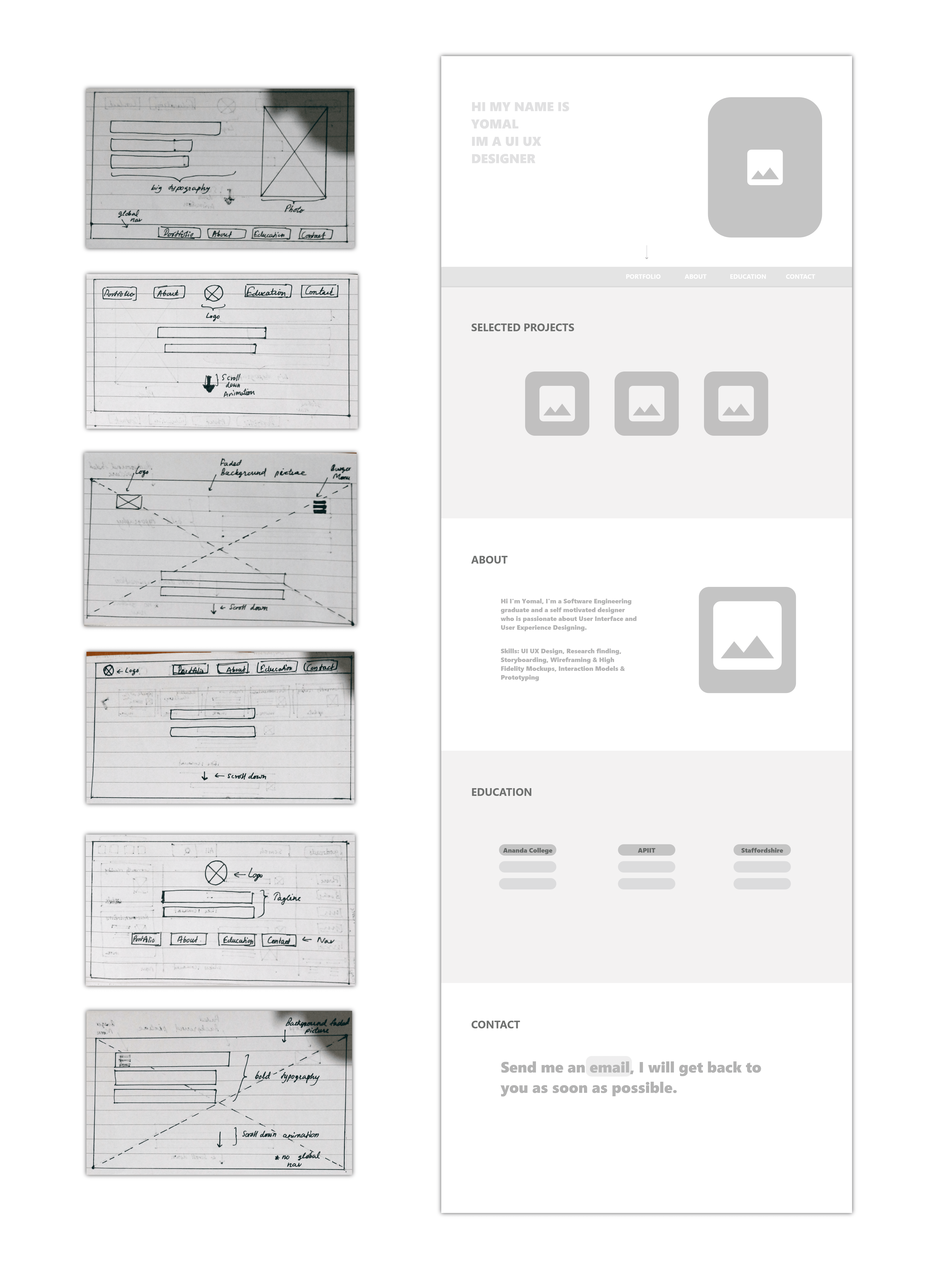
Low-Fi Wireframe iterations & Mid-Fi Wireframing
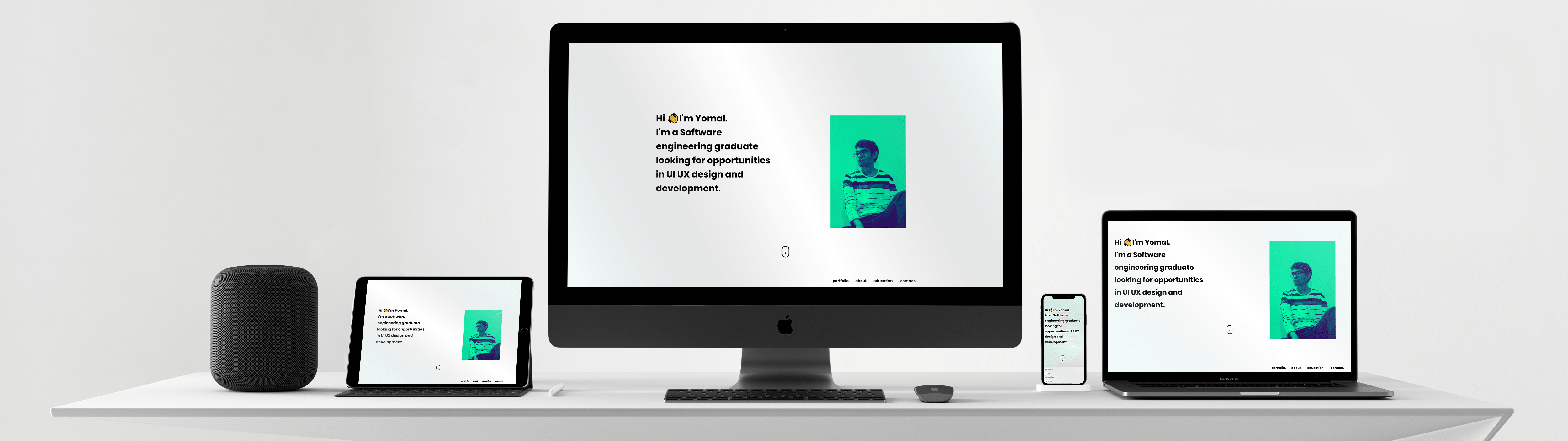
I decided to have a single page design to deliver the landing and the basic information such as brief introduction about myself, education, and contact information. I made use of white spaces in-between different content on the page to give a more simplistic and clean look as well as to help the user easily identify each different type of content from one another. For the case studies I decided to use a thumbnail gallery in the same page that would direct the user to each case study in a separate page. To navigate to different content in the page I used a fixed navigation menu at the bottom of the screen. The reason behind choosing a single page layout was to make the content easily accessible and skimmable to the visitors of the website without taking too much of their time. For the case studies I made their own fixed navigation menu, each page having a link to the previous project, next project, and a link back to Home page.
Design & Development
Mid-Fi to Design
I skipped Hi-Fi Mockups and started testing out design elements while developing rather than figuring out design elements first since I already had a clear vision of what I wanted the website to look like by now, and doing Hi-Fidelity Mockups and prototyping would have been spending more time on one stage whereas doing both at the same time was efficient and practical for this project.
Platform Vs. Coding
I decided to code the website rather than use a platform services to make one since it's way cheaper and gives me more freedom to choose the design elements that I want to include rather than having to choose from a set of given elements.
Platform Vs. Coding
I decided to code the website rather than use a platform services to make one since it's way cheaper and gives me more freedom to choose the design elements that I want to include rather than having to choose from a set of given elements.
Style Guide & Design Elements
After testing different design elements I came up with a style guide to use as a set of standards to unify the design among different pages and web, tablet and mobile platforms.
Style Guide & Design Elements
After testing different design elements I came up with a style guide to use as a set of standards to unify the design among different pages and web, tablet and mobile platforms.
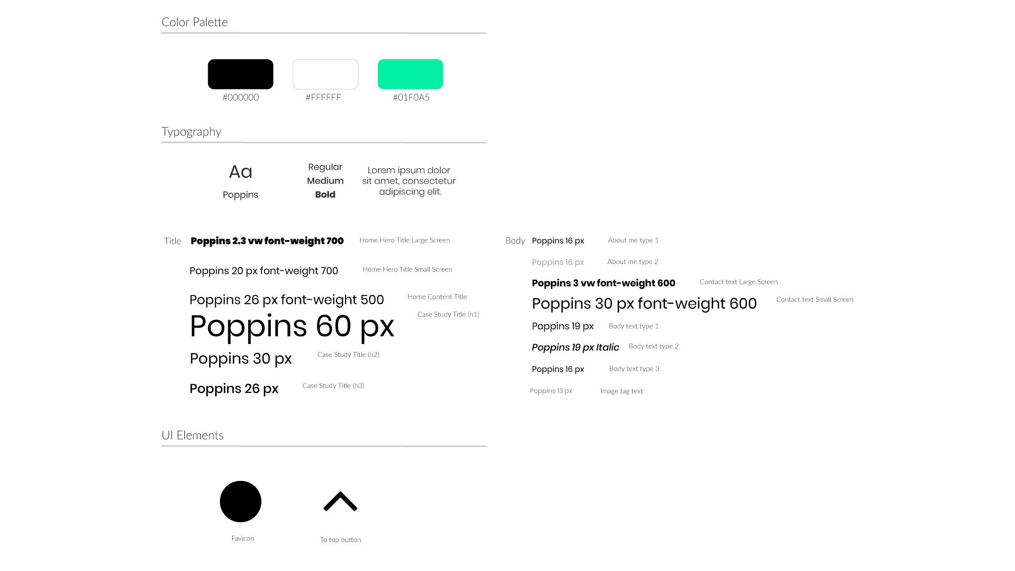
Style Guide
The main goal while designing elements for the website was to make the best possible experience for the visitor, in this case recruiters and hiring managers. Since the target visitor is likely visiting the website during busy work hours, my aim was to provide efficient structural and navigational elements which made the time they spend on this website worthwhile. This was achieved by several design elements ranging from the single page design, fixed menu for easy navigation, white spaces to easily identify different sections, as well as using larger fonts to highlight important sections and smaller fonts for detailed paragraphs to make the content easy to digest and skimmable.

Use of white spaces and different fonts to differentiate between content & Bottom navigation fixed menu
Custom Illustrations
This being my personal website I thought of using custom illustrations drawn by myself to be used as banner images and thumbnails for case studies as a way of adding some of my own personality into it. Since I've had a passion for art ever since I could remember this was a fun side project for me to work on as well.
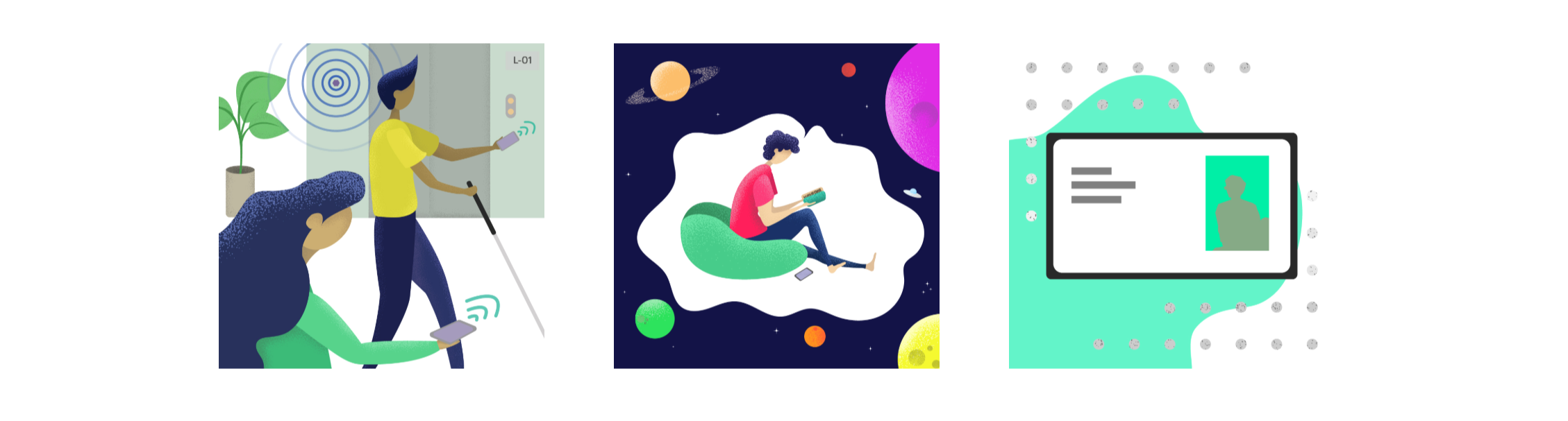
Custom illustrations used as thumbnails
Final Touches
After coding the pages it was now time to add the final touches such as checking responsiveness and optimizing for mobile, adding favicons, testing in different browsers, making sure pages have context and are linked properly, checking metadata and cleaning up html, checking spelling erros, etc, etc and then finally launching the site. For hosting the website I chose github pages which allows free hosting through github repository.
Reflection
The thought of creating a web portfolio was a bit of an overwhelming thought at first, specially because there are so many impressive and well designed portfolios all over the web. But once I started the process it just became more and more interesting and exciting to work on. Even though it might not be the most amazingly designed portfolio on the internet, I think I successfully achieved what I wanted when I visualized what my web portfolio to look like, which is simplistic and efficient. Moving forward I plan to consider this as an ongoing project and make better improvements as I sharpen my skills and gain better experience.