Goodreads Heuristic redesign
The Project
Project Duration: 1 Day
Goodreads is a social cataloguing platform where book enthusiasts can search and catalogue their books, and connect with others in the book reading community. Even though I have heard about goodreads, I didn't really look into it until recently when I started reading some of my unfinished books that I have been neglecting for a while that were gathering dust in my bookshelf. I thought keeping track and reading the thoughts and ideas from other readers on the books would motivate me to keep reading them and develop more interest, which it certainly did. But from the get go I realized that even though goodreads is providing an amazing platform for book readers, most of its functionality is hindered by the confusing navigation and the outdated look and feel on both their website and their mobile application.
The aim of the project was to re-design the goodreads website and mobile application to make a cohesive platform, with a new effective and efficient user first User Interface while maintaining their current brand identity.
The Process
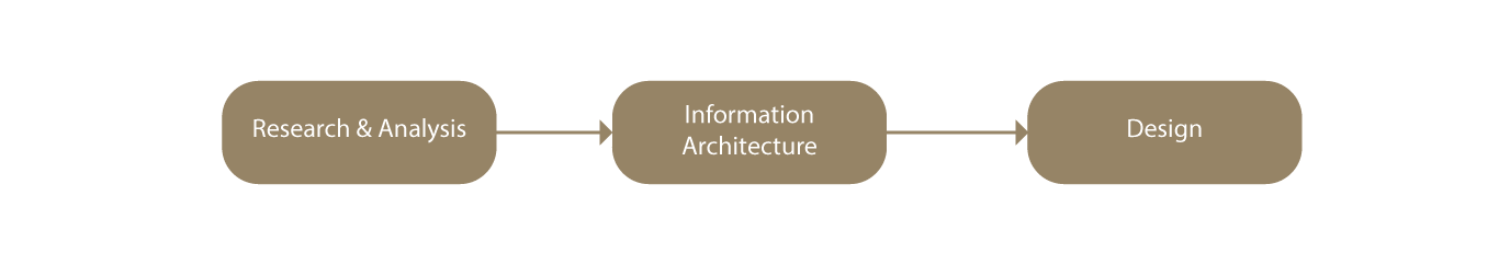
Process flow

Research & Analysis
Content Research & Analysis
To fully understand the contents and features of Goodreads, I assessed the main functionalities in both web and mobile platforms and how they are structured in each version.
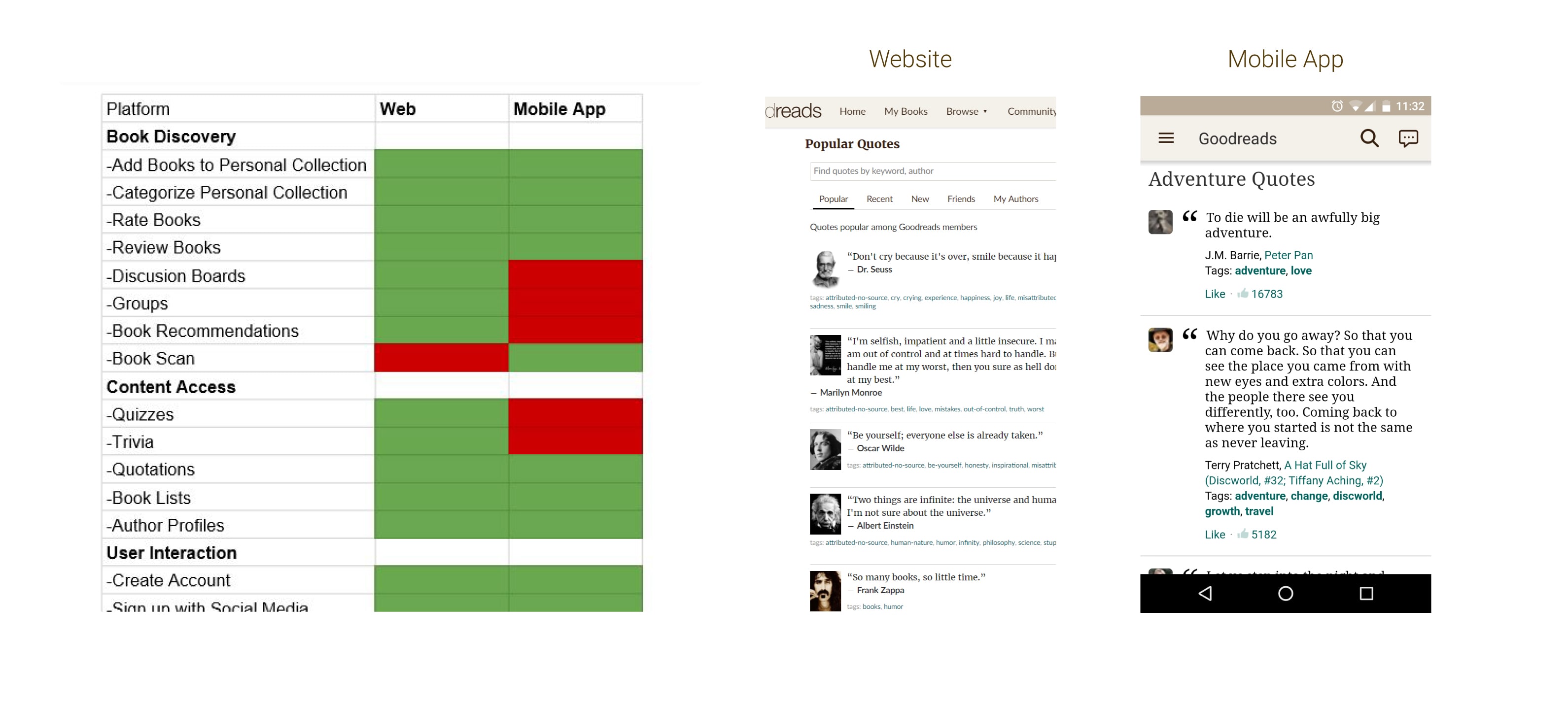
Platform features comparison
For example, on the website you can access the quotes section by going through Navbar Menu -> Community -> Quotes, Whereas in the mobile application the user will have to go through Collapse Menu Button/ Right Swipe -> Explore -> Explore By Genre where the user will have to select one of the given genres to access the quotes specific to that genre. As seen by the example given in the image below, not only was the process of accessing this content different from each platform, but the end results for majority of the functions was different as well.
Content Research & Analysis
To fully understand the contents and features of Goodreads, I assessed the main functionalities in both web and mobile platforms and how they are structured in each version.
Platform features comparison
For example, on the website you can access the quotes section by going through Navbar Menu -> Community -> Quotes, Whereas in the mobile application the user will have to go through Collapse Menu Button/ Right Swipe -> Explore -> Explore By Genre where the user will have to select one of the given genres to access the quotes specific to that genre. As seen by the example given in the image below, not only was the process of accessing this content different from each platform, but the end results for majority of the functions was different as well.
User Research & Analysis
By using online web analytic services I gathered census on Goodreads for areas such as user traffic, demographies, user geography, platform engagements, and other user characteristics. Gathering these data helped me to make informed decisions towards the design and functionality of the solution.
User Research & Analysis
By using online web analytic services I gathered census on Goodreads for areas such as user traffic, demographies, user geography, platform engagements, and other user characteristics. Gathering these data helped me to make informed decisions on towards the design and functionality of the solution.
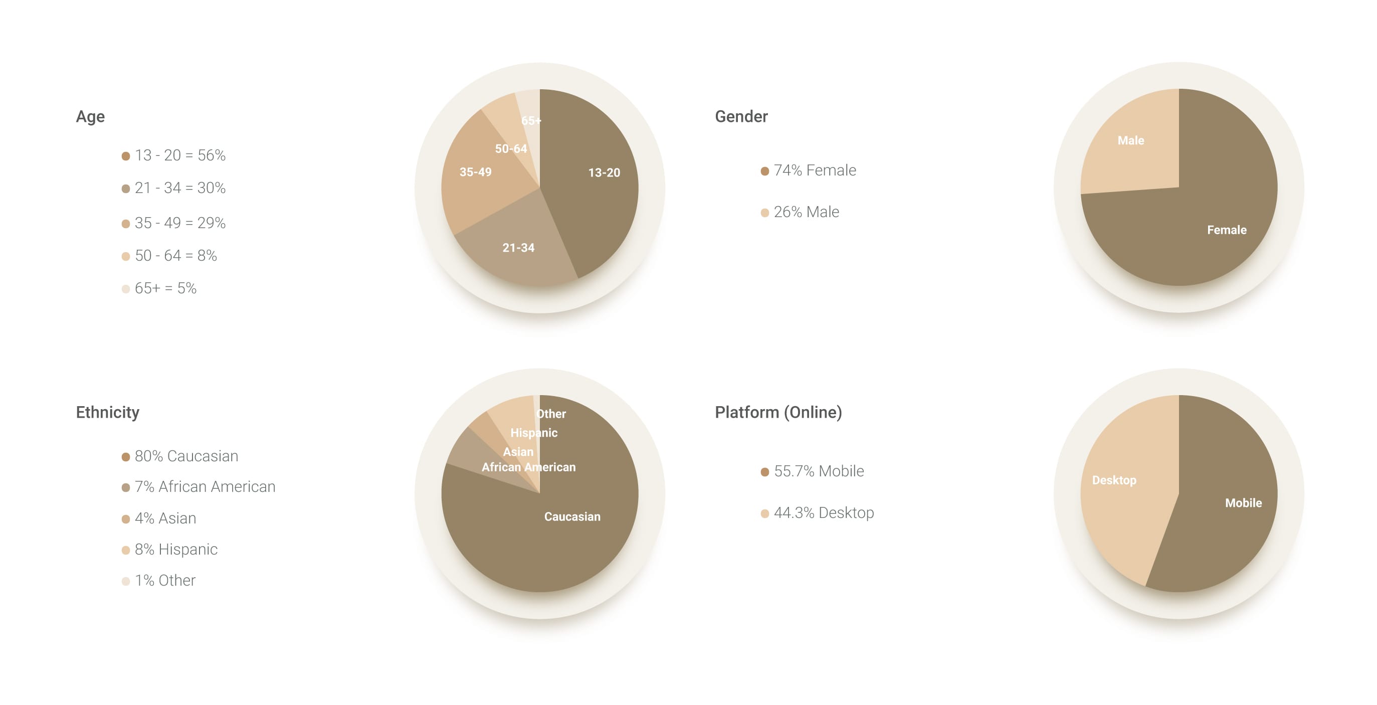
Sample User Analytics
Noteworthy data from collected analytics (From 1st November 2018 to 30th November 2018)
▪ For the month of November Goodreads had a total of 220.9 million online global views
▪ Out of the Goodread users 74% was Female and 26% was Male
▪ 51% of Goodread users was under 34 years old, while majority of them was within the age range of 25-34
▪ Education wise 28% had no College level education, while 46% had College level education and 26% had Graduate School level education
▪ Ethnicity wise majority were Caucasian at 80%, while the rest was 7% African American, 4% Asian, 8% Hispanic and 1% other
▪ With platform engagement 55.7% was using mobile while 44.3% used the desktop version
I also gathered feedback and comments left by users in the appstore and on their website about the mobile application, allowing me to get a general insight on what they dislike, their goals using the application, and what they would like to see added or improved in the platform.
I also gathered feedback and comments left by users in the appstore and on their website about the mobile application, allowing me to get a general insight on what they dislike, their goals using the application, and what they would like to see added or improved in the platform.
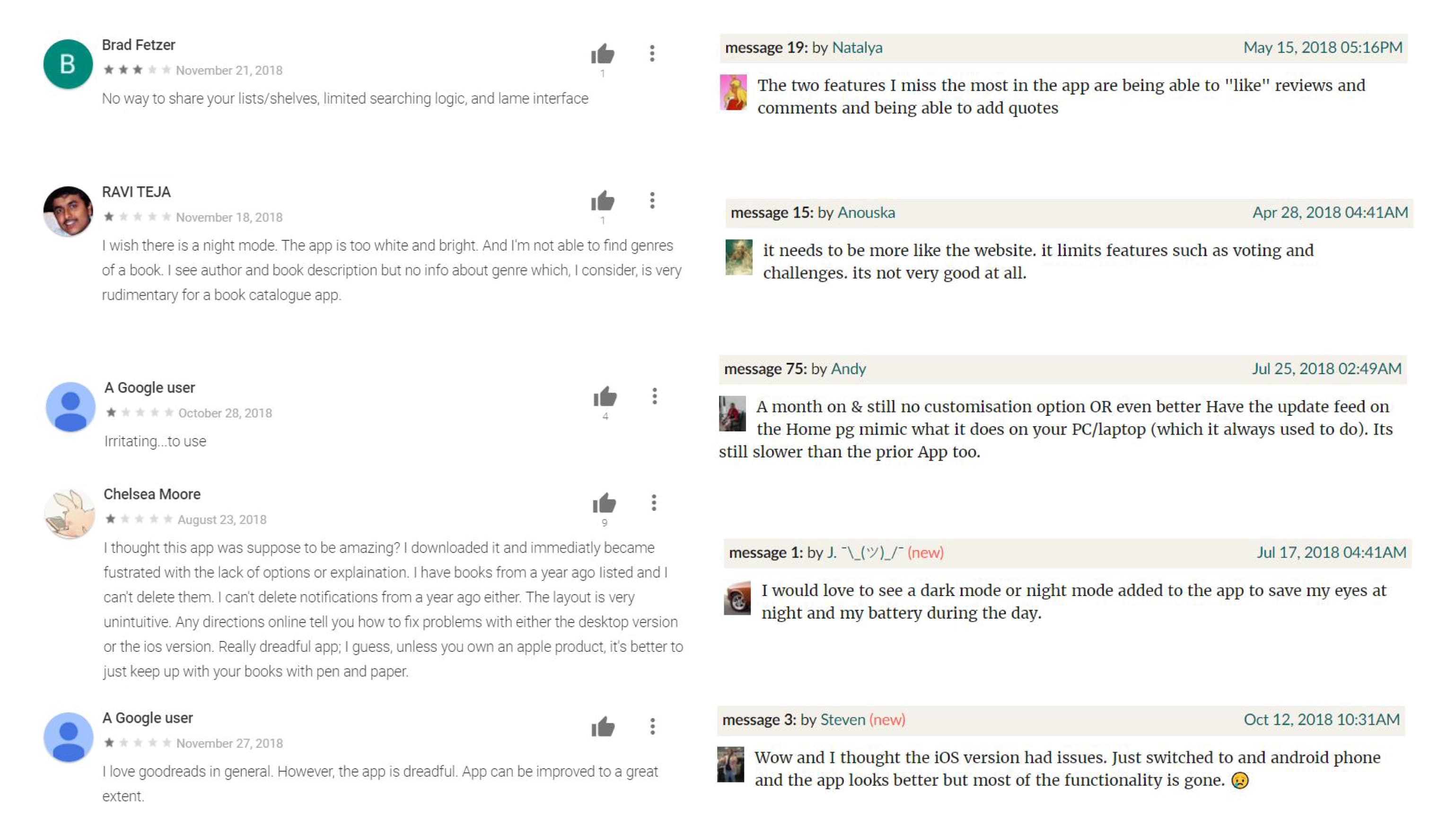
User feedback from Appstore and Goodread forums
User personas
With the information gathered from the user feedbacks User personas were created to base the design on a user first approach.
User personas
With the information gathered from the user feedbacks User personas were created to base the design on a user first approach.
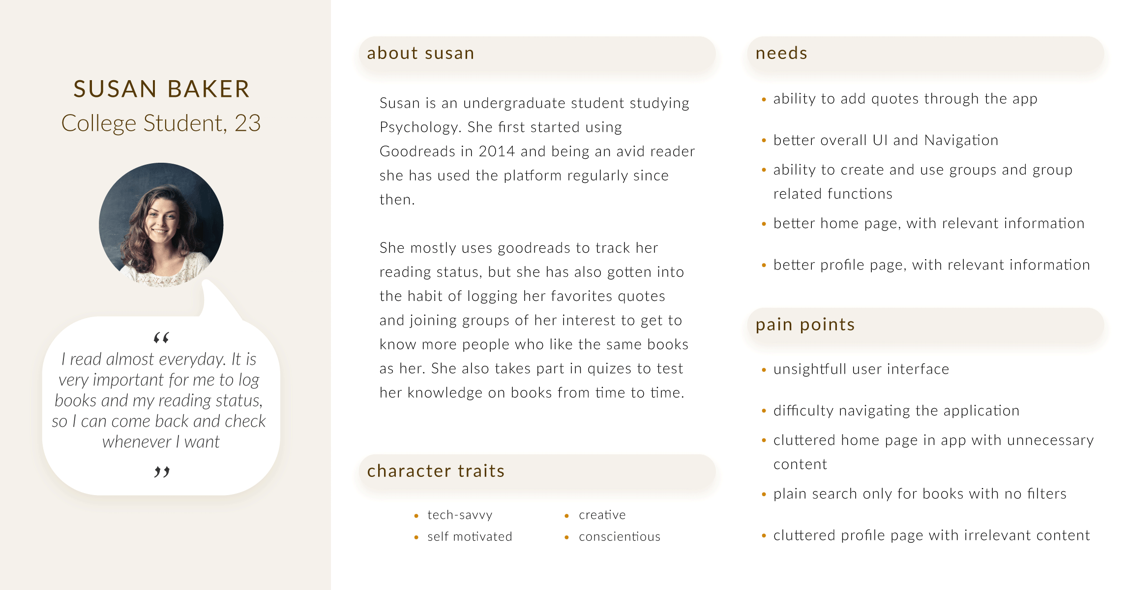
Sample User Persona
Prioritizing Scenarios
Using the feedbacks and user personas, I brainstormed about user scenarios and user needs to come up with a number of features and key points that should go into the redesign. Then using the MoSCoW method I prioritized them.
Prioritizing Scenarios
Using the feedbacks and user personas, I brainstormed about user scenarios and user needs to come up with a number of features and key points that should go into the redesign. Then using the MoSCoW method I prioritized them.
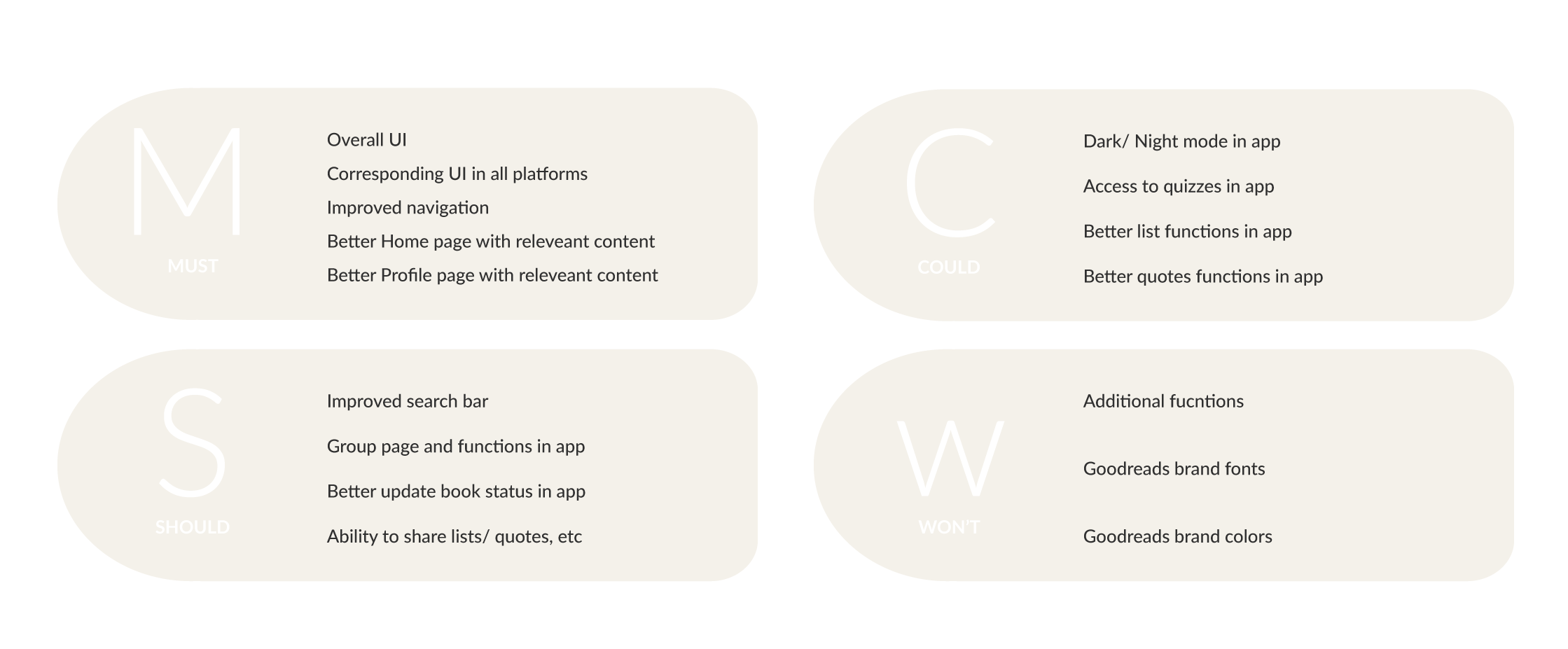
Prioritizing using MoSCoW method
Information Architecture
Information Architecture Digram
I started designing the Information Architecture by changing certain elements from the existing Information Architecture. Redesigning the existing IA than creating a new one from scratch allowed me to keep some of the existing user flows which are familiar to the users while removing non user friendly elements such as repeated and miscategorised components that made navigating the platform confusing and frustrating, while introducing new user flows and components to improve the IA.
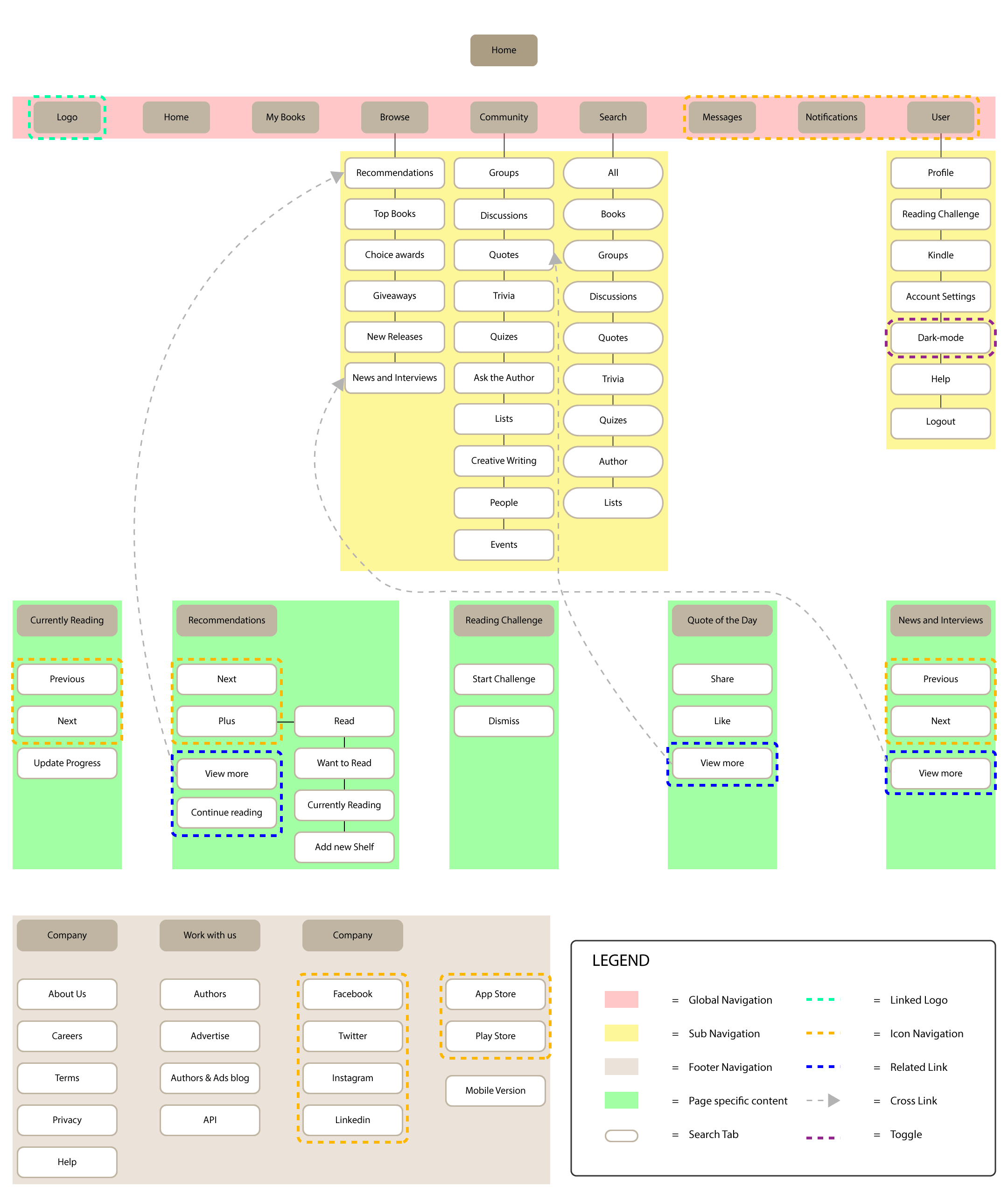
Home Page Architecture for the Website desktop version
Low-Fidelity Wireframing
To explore different possibilities I sketched Low-Fidelity pen and paper wireframes to put initial ideas into a sketch and figure out the best possible layouts for the platform by going through a variety of them.
Low-Fidelity Wireframing
To explore different possibilities I sketched Low-Fidelity pen and paper wireframes to put initial ideas into a sketch and figure out the best possible layouts for the platform by going through a variety of them.
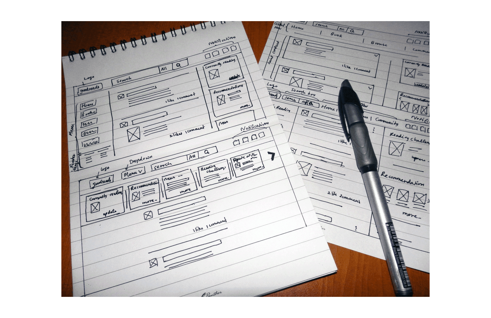
Low-Fidelity Wireframe sketching for Home desktop version
Design
Hi-Fidelity Mockup
since I already had a clear idea of what I wanted the UI to look like by now, I skipped the Mid-Fidelity wireframes and did the High-Fidelity mockups of the UI.
Hi-Fidelity Mockup
since I already had a clear idea of what I wanted the UI to look like by now, I skipped the Mid-Fidelity wireframes and did the High-Fidelity mockups of the UI.
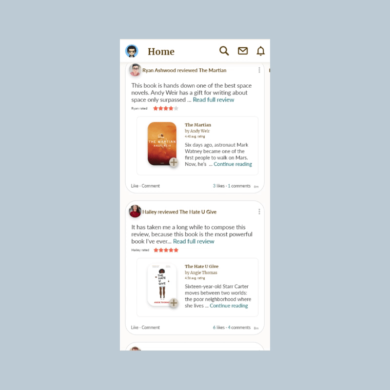
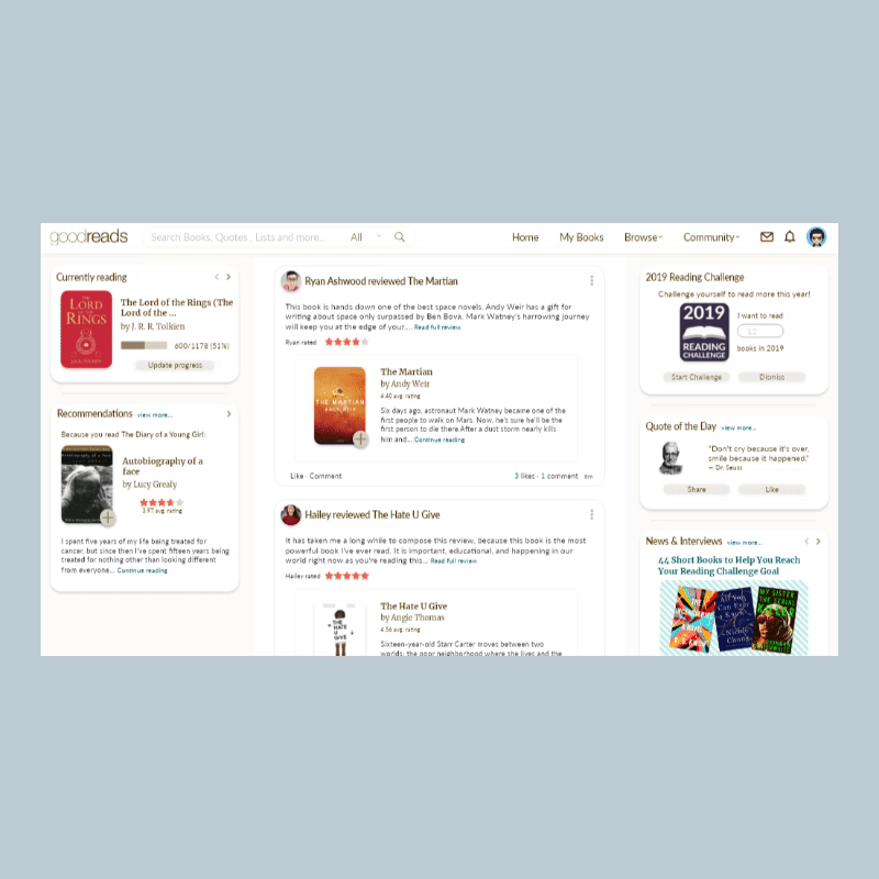
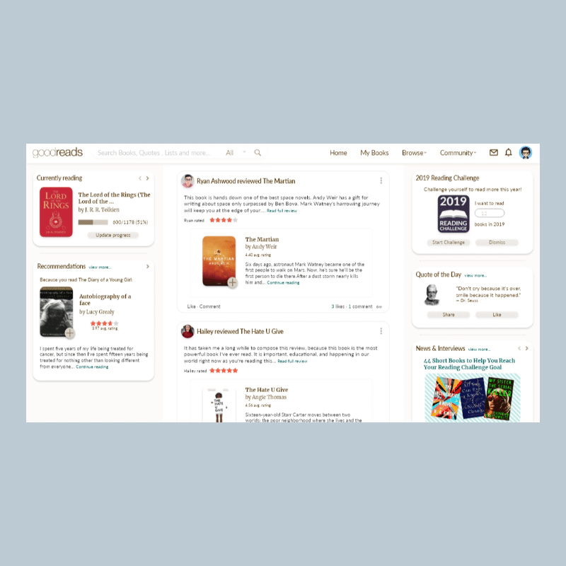
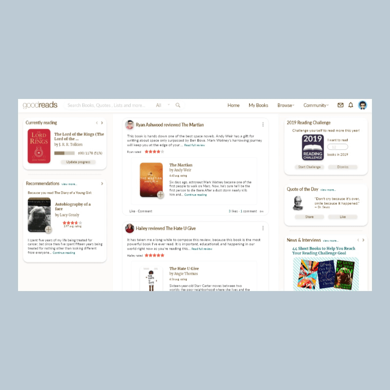
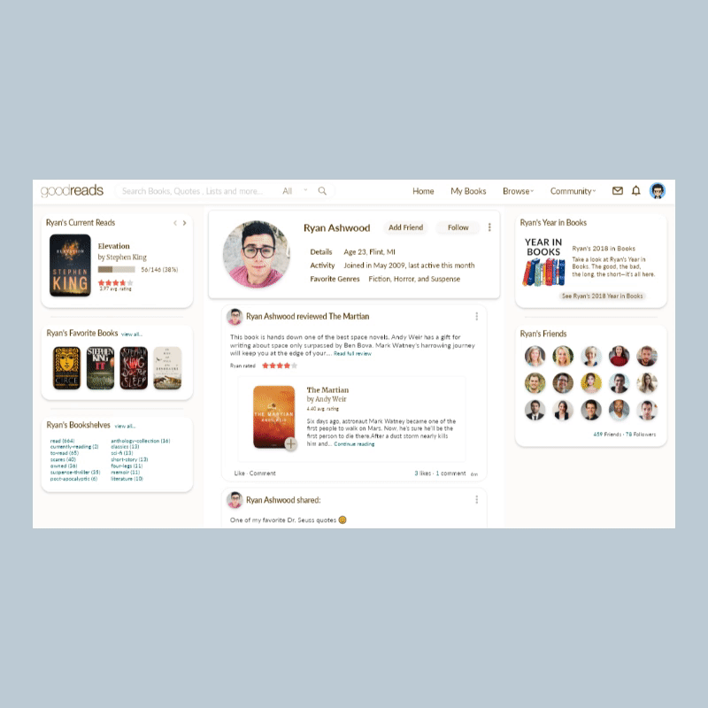
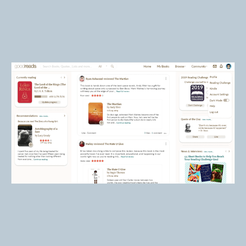
The primary goal was to declutter the User Interface towards a minimalistic look while still delivering necessary information and content to the user. For instance in the home page I kept a similar layout for the website while introducing new elements to seperate different types of content allowing the user to easily recognize one type of information content from one other. For the mobile design I used similar elements from the desktop version to maintain a corresponding theme between the platforms.
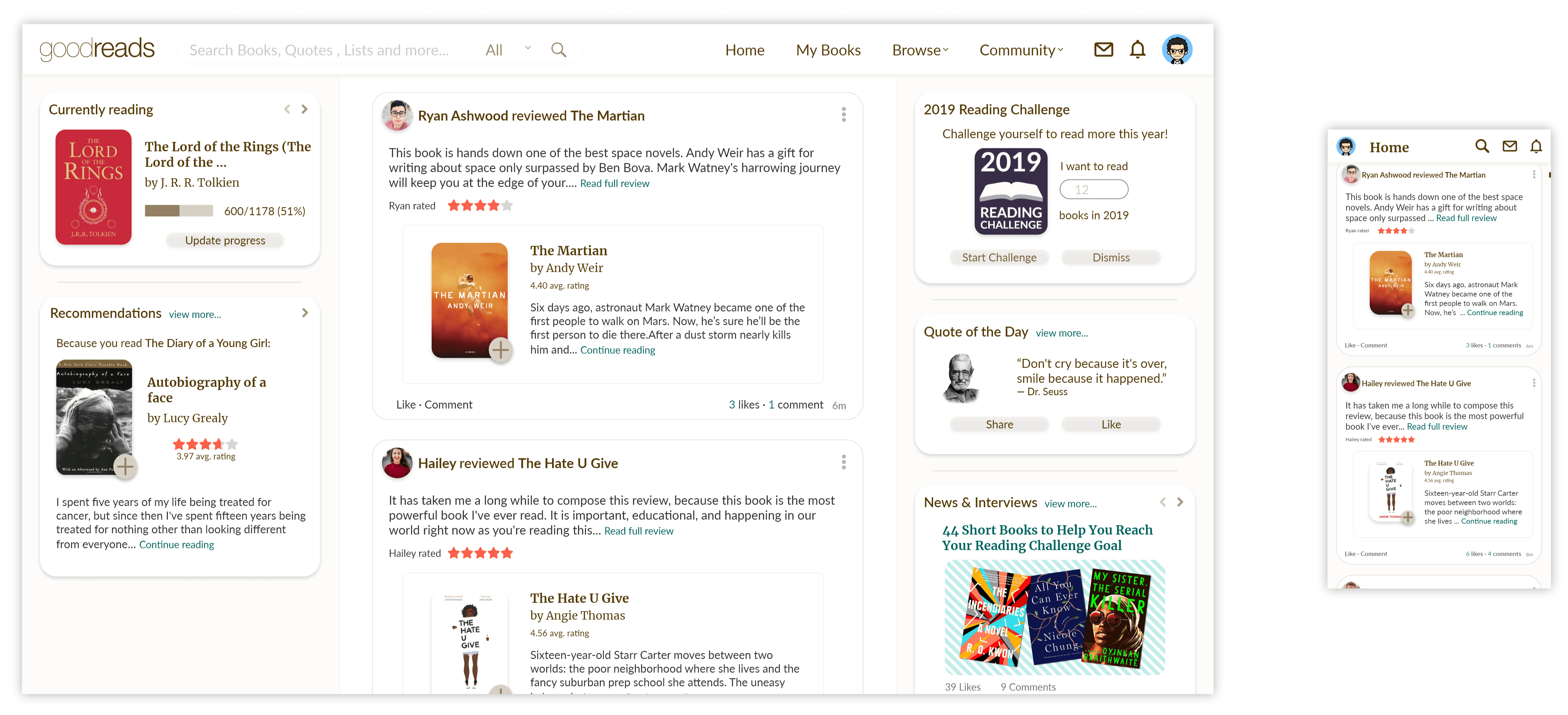
Home Page redesign
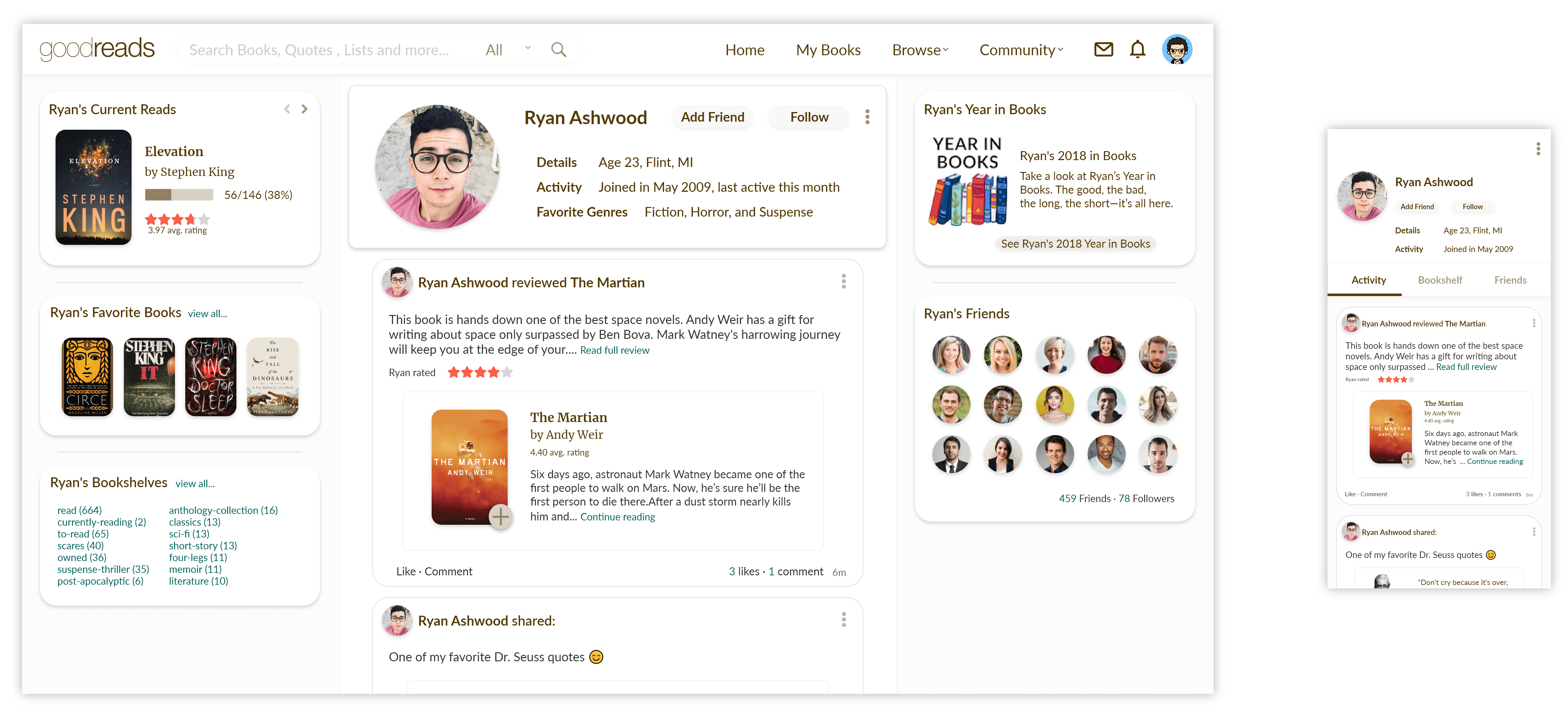
Profile Page redesign
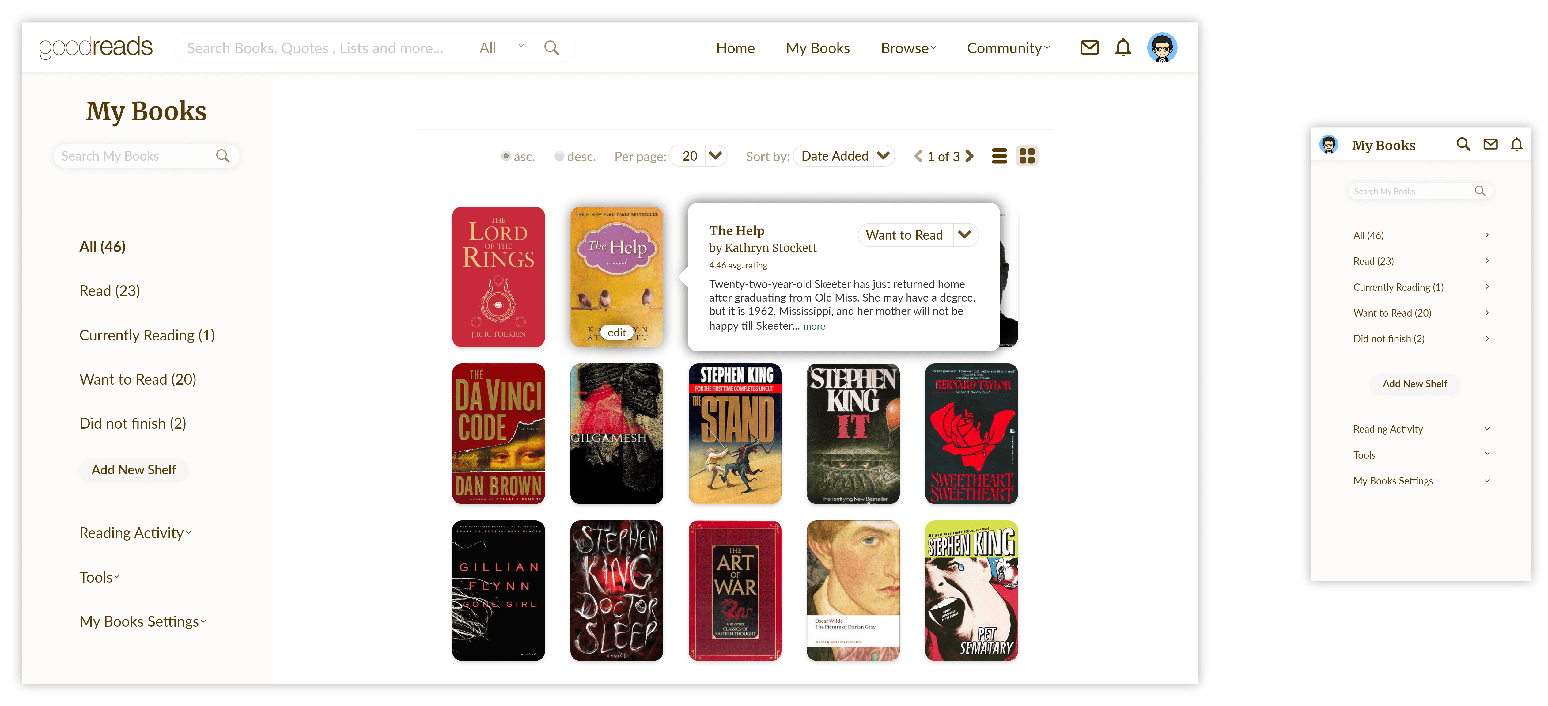
My books Page redesign
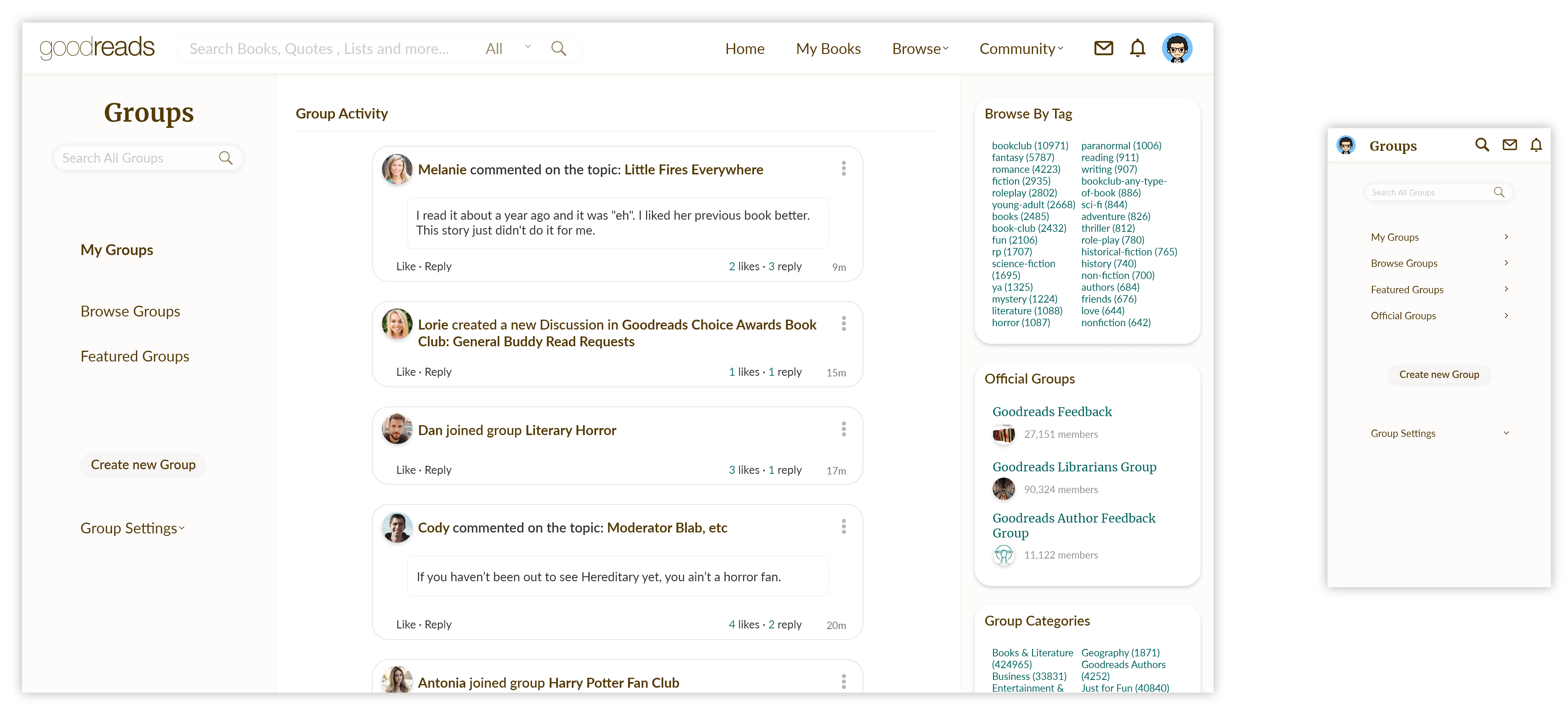
Groups Page redesign
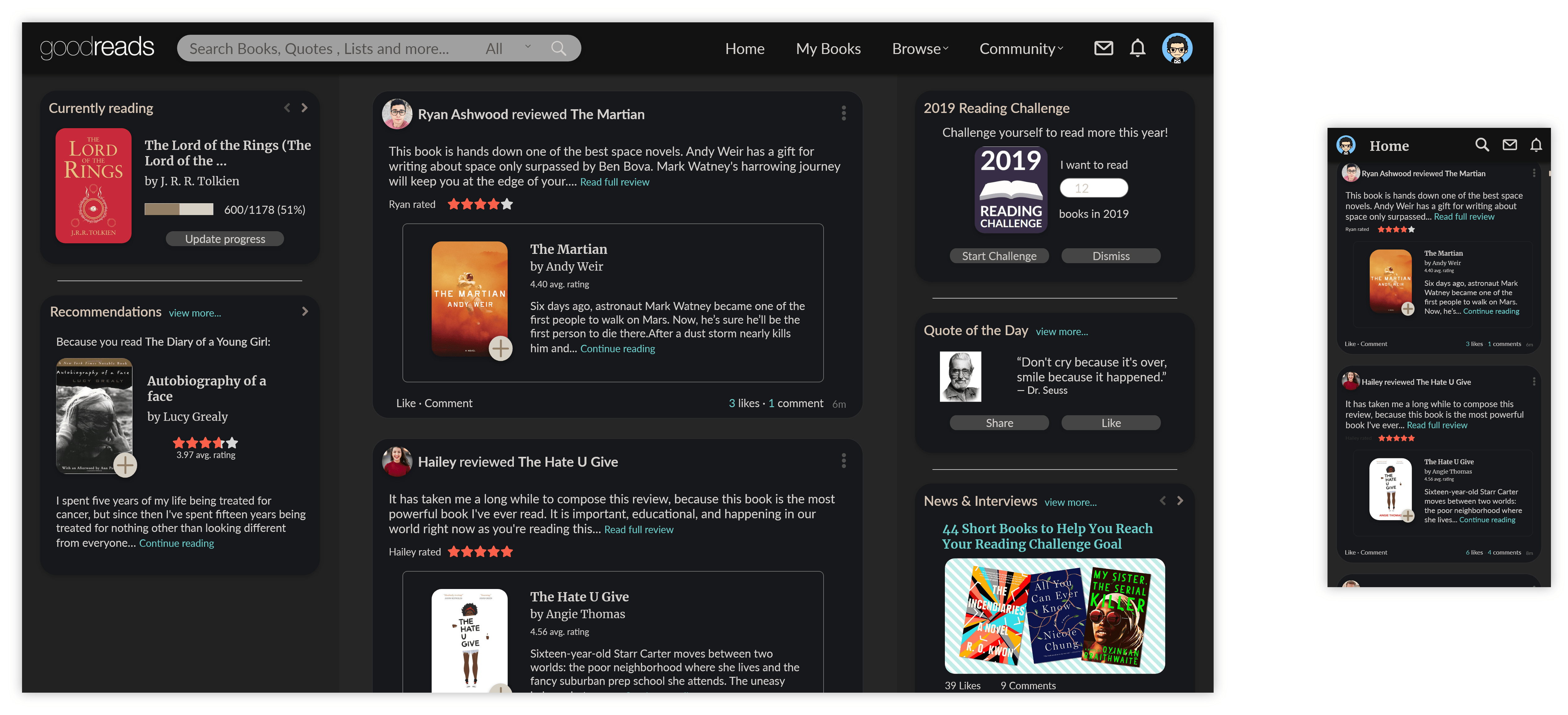
Dark mode Page design
Interaction Design
Interactive high fidelity prototypes were made to define and identify user interactions with the UI. Creating these interactions allowed me to anticipate and mitigate errors which the user might face while interacting with new UI elements.
Interaction Design
Interactive high fidelity prototypes were made to define and identify user interactions with the UI. Creating these interactions allowed me to anticipate and mitigate errors which the user might face while interacting with new UI elements.

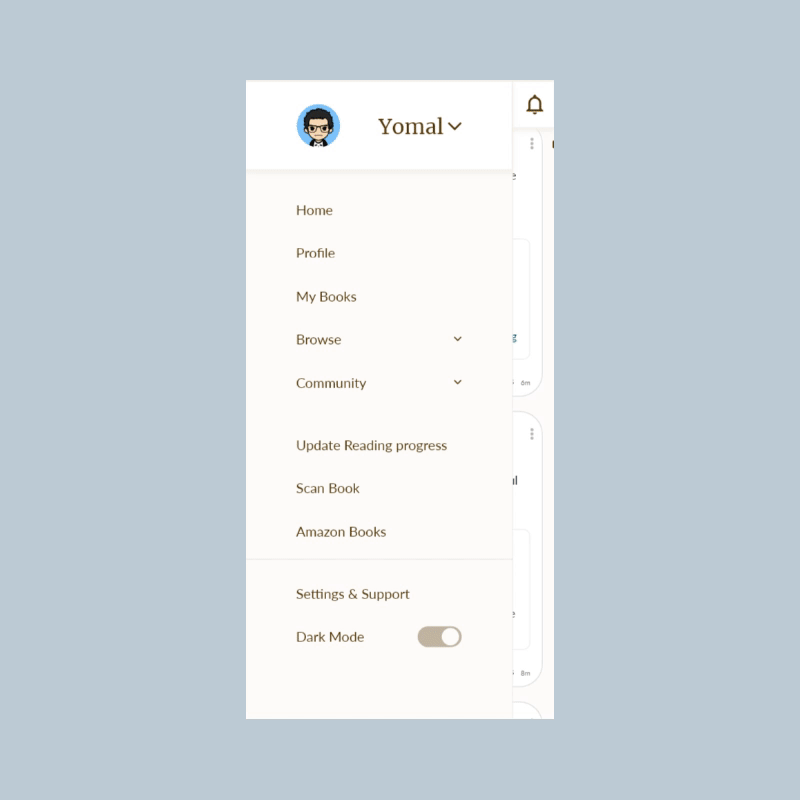
Mobile App side menu

Mobile App search function
Mobile App Dark-mode
Mobile App update book progress
Desktop sub menu
Desktop search bar
Desktop currently reading tab
Desktop add friend/ follow user
Desktop Dark-mode